(Quick Reference)
Grails Platform UI - Reference Documentation
Authors: Marc Palmer (marc@grailsrocks.com)
Version: 1.0.RC2
1 Overview
The Platform UI is a sister plugin to
Platform Core.
Where Platform Core provides "plumbing" for plugins and applications, Platform
UI provides common UI and Theming support for plugins and applications so that they can achieve high level visual integration.
It is designed to be as lightweight as possible and completely CSS and JS framework agnostic.
Platform UI provides
UI Sets and
Themes via APIs and GSP template discovery.
These are two separate mechanisms - UI Sets can be used without using Themes - and most of the time there will be more Themes than UI Sets. Themes use specific UI Sets to render UI elements with the correct markup, CSS and JS in a manner coherent with the layout markup and CSS they are using.
What is a UI Set?
A UI Set is a set of GSP templates and resources that provide the HTML and
optionally CSS required to render the standard UI tags.
Applications and plugins can therefore use the standard UI tags from this plugin without worrying about how they are actually rendered or implemented in the application - so in theory your plugin might have its elements rendered by a Twitter Bootstrap plugin in one app, or a jQuery UI plugin in another app.
It doesn't matter which because:
- Your code renders its UI using the
ui:xxx tags, which output the correct structural HTML using the UI Set
- The current UI set automatically handles inclusion of the correct JS and CSS resources to achieve this
The application author can choose the UI set used on any given request, but usually this will be the same across the whole application. This choice may be made indirectly through the use of Themes.
UI Sets do not have to supply any CSS and JS files - if they do, they should be defined using the Resources framework such that they can be overriden by Themes or the application developer.
For example a UI Set might apply a CSS class "well" to a <div> it puts around the content of a
ui:block tag, but it does not have to provide the styling for this - in fact many themes may use the same UI Set and override the CSS that the UI Set provides to style the "well" elements differently.
What is a Theme?
A Theme is a set of GSP Sitemesh templates and other GSP fragments that supplies a set of standard screen layouts for an application.
The standard layouts such as "home", "dialog", "dataentry", "report" etc. provide the basic screen layouts most apps require, such that plugins can rely on these being present so that they can integrate with your chosen app UI relatively seamlessly.
It may do this using any CSS/JS framework it chooses, and it will choose a UI Set that expresses UI elements in a way consistent with the layout framework.
For example there may be five different Twitter Bootstrap based themes that provide different look and feel - but they all may use a single underlying Twitter Bootstrap UI Set because the structural markup and JS behaviours are identical.
This is NOT a grand unified UI framework
It is very important to understand that Platform UI
does not attempt to be a universal UI toolkit.
The goal is to provide
just enough common UI widgets for plugins to expose basic UI screens that will be automatically styled
to fit the Application's theme - and to provide
only the most common site styling elements needed for an effective system
of replaceable application Themes.
It is not possible to make a single unified UI framework - take a look at what is already out there in the web space and you will see that everyone has different ideas about what different widgets are, how they should work, and apps often add custom widgets that replace or augment others from the library they chose.
Therefore you will not find a UI widget for a scrollbar or a rich editor, or a tree view etc. What you will find is abstracted
rendering of fields, forms, tables, logos, buttons etc.
Applications are of course free to use the full range of CSS styling available to them, in addition to the base styling of the
theme that they choose.
What you will typically do in professional applications is define your own Theme by forking another, and then you can make all the UI tags do exactly what you want for your application.
This is only possible because plugins will be able to use the UI tags to delegate how to actually render elements.
2 Change Log
1.0.M1
Changes since previously released snapshots
- New ui:actions handling (capturing body) and requirement for _form.gsp to render ${actions}
- Change of model variables in _logo.gsp from w/h to width/height to avoid any possible taglib namespace clashes if values are null
- Added fieldClass on ui:field model
- Added inputClass on ui:input model
- Added messageClass on ui:message model
3 Getting Started
This section will take you through the process of creating a simple application that shows you how the Theme and UI APIs work together
to provide pluggable UI rendering.
To get started you need to install the Platform UI plugin, and for this example you'll also need a Theme plugin.
3.1 Installing dependencies
Add the plugin platform as a dependency to your application or plugin, either directly or transitively. To do so directly edit your
BuildConfig.groovy to look something like this:
    ...
    plugins {
        ...
        compile ':platform-ui:1.0.RC1'
    }
You can run your code now and browse to
http://localhost:8080/<appname>/platform/ui, a special page available only in the development environment. From there you can explore some of the plugin platform features, preview UI Sets and Themes etc.
A default unstyled Theme and UI Set are included out of the box. They're not particularly useful although they do provide some proof of concept defaults, so we'll install another to show what's possible.
Installing a theme for the sample application
Installing a theme requires you to introduce a plugin that containes one or more themes, or create your own theme in your app.
Let's use the vanilla Twitter Bootstrap theme.
Add the following to the "plugins" section of your BuildConfig.groovy:
runtime ':bootstrap-theme:1.0.RC2'
Alternatively you can run
grails install-plugin bootstrap-theme.
With that done, you'll have the bootrap-theme templates read to go, as well as a transitive dependency on
bootstrap-ui which provides the required UI Set templates and resources. This is how many Bootstrap based themes could be written easily to provide different layouts etc, while reusing the same underlying UI Set. It turns out that the UI Set is the biggest piece of work - Themes are easy to implement.
We don't need to do anything to configure the default theme in the app to use the Bootstrap theme because it is the only non-default theme we have installed. Platform UI will use the first installed theme in alphabetical order if we have not told it otherwise.
3.2 Adapting views to Themes
So far nothing will have changed in your app. A theme has no effect unless your GSP specifies a theme layout to use. This is because Themes are built on top of Sitemesh layouts, and a Theme layout is really a Sitemesh layout.
So we just need to create a home page GSP that uses the theme tags to present our content. Create a new file in
grails-app/views/index.gsp or edit what is there, to contain this:
<html>
    <head>
        <theme:layout name="home"/>
        <theme:title text="home.page.title"></theme:title>
    <head>
    <body>
        <theme:zone name="body">
            <ui:h1 text="home.page.body.heading"/>
            <p><p:dummyText/></p>
        </theme:zone>
        <theme:zone name="banner">
            <ui:carousel>
                <ui:slide active="${true}">
                    <ui:h1 text="Demo Banner Text"/>
                    <ui:h2>Always says something interesting</ui:h2>
                </ui:slide>
                <ui:slide>
                    <ui:h1 text="Inspiration"/>
                    <ui:h2>Blue-skying maverick technologies</ui:h2>
                </ui:slide>
                <ui:slide>
                    <ui:h1 text="Destabilizing"/>
                    <ui:h2>Revolutionizing vertical potential</ui:h2>
                </ui:slide>
            </ui:carousel>
        </theme:zone>
        <theme:zone name="panel1">
            <ui:h3 text="home.page.panel.1"/>
            <p><p:dummyText size="1"/></p>
        </theme:zone>
        <theme:zone name="panel2">
            <ui:h3 text="home.page.panel.2"/>
            <p><p:dummyText size="1"/></p>
        </theme:zone>
        <theme:zone name="panel3">
            <ui:h3 text="home.page.panel.3"/>
            <p><p:dummyText size="1"/></p>
        </theme:zone>
    </body>
</html>
Now run your app and browse to the home page. You should see something like this:
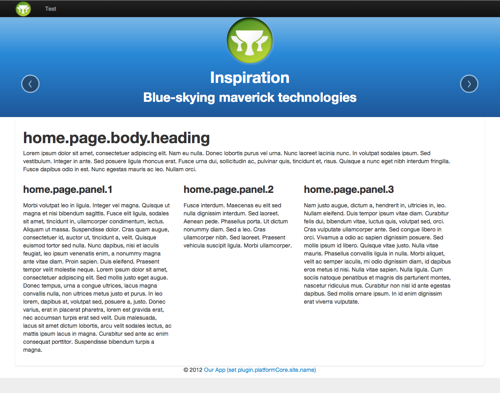
Creating a login form is a good example of how you can use Themes and UI Sets to build some UI that is independent of look and feel.
Create a
TestController with a
login action and save
login.gsp in
grails-app/views/test/ and place this in it:
<html>
    <head>
        <theme:layout name="dialog"/>
        <theme:title text="login.page.title"></theme:title>
    <head>
    <body>
        <theme:zone name="body">
            <ui:h1>Please log in</ui:h1>
            <ui:form>
                <ui:field name="username"/>
                <ui:field name="password" type="password"/>
                <ui:actions>
                    <ui:button>Log in</ui:button>
                    <ui:button>I forgot my password</ui:button>
                </ui:actions>
            </ui:form>
        </theme:zone>
    </body>
</html>
Now browse to
/test/login and view the form. Notice how you have no styling or structure related code in your markup.
If you had more themes installed you could switch to others to test the same form in them.
4 Making plugin UIs that integrate with apps
One if the main wins of Platform UI is that plugins can expose UI without having a style that clashes with that of the application, and with less work required to create "good enough" UIs that the application developer can then style more specifically if they need to.
Exposing a reusable UI in a plugin
There are some key considerations to providing a UI that the developer will be able to use with their chosen look and feel.
- Avoid custom layout markup, the Theme controls layout
- Add CSS classes to container elements where customisation may be desirable (allows app dev to override CSS for plugin UI elements to fix up layout issues)
- Only where absolutely necessdary, supply a non-standard theme layout of your own, and the developer can adapt it for their theme. Document the zones required.
- There is no standard grid, try to stick to fluid or % based layout
How to implement non-standard UI elements
With 1.0 you'll have to create your own tag that uses a GSP template to render your field, so that the application developer can override that GSP template to match the UI set and theme they have chosen.
In the future it should be possible to reuse existing UI tags and helper methods to achieve this using the same conventions used by UI Sets.
You can make your plugin UI adaptive based on the theme or UI set in user, or the presence of other plugins in the app.
- Your plugin can provide resource "overrides" for resource modules provided by specific UI sets or themes. You can replace existing resources or monkey in your own code into a module by adding a dependency.
- Your plugin can detect presence of plugins using the Grails plugin:isAvailable tag
- Your plugin can detect the current Theme and UI Set in use in the request using the ui:ifSetActive and theme:name tags.
Customising UI provided by a plugin
The application developer needs to be able to customize or "fix up" the UI you provide. It's simply not possible for you to provide a UI that looks perfect in every different Theme and CSS/JS framework the user chooses.
The developer has the following options to provide customisations of your UI:
- UISet CSS class overrides, for when you are using normal UI Set tags
- CSS using CSS classes you have applies to container elements and documented
- Theme layout overrides, allowing them to replace specific Theme layouts to work around problems
- UISet template overrides, allowing them to replace UI tag implementations
- GSP view overrides, the nuclear option which allows them to override your plugin's view
5 Recipes
These sections explain how to achieve some common functionality using the UI APIs.
5.1 Setting the theme at runtime
The current theme is determined on a per-request basis. If no theme is explicitly set, it will default to the theme specified in Config.
One use of this is to allow the user to select the look and feel of an application. You could also change the theme based on the current User Agent, or based on the Locale of the user for example.
You can call the
theme:set tag from inside a controller or GSP:
<theme:set name="mega"/>
You can also access the
grailsThemes bean and set the theme per-request or per-session, from a service, filter or controller:
    // Set it once now and forget for the future requests
    grailsThemes.setSessionTheme(request, "mega")

    // Or just set it for this request
    grailsThemes.setRequestTheme(request, themeNameFromUserPreferences)
Inputs in forms can sometimes deviate from the straight forward label plus widget pattern. Some forms require an alternative layout for some fields, aggregation of multiple fields into one visual group - say a "from" and "to" date that represent a period.
You can usually achieve this with UI Set tags by making use of the
ui:field customisation tags
ui:fieldInput,
ui:fieldErrors,
ui:fieldLabel and
ui:fieldHint.
These allow you to use
ui:field but replace the various components of a field (label, hint, errors, input) with your own markup - which can use other UI tags.
Say we needed to render two date fields using a single label for the two, to specify a date period:
<ui:form>
<ui:field label="report.date.range">
<ui:fieldInput>
<ui:input bean="${form}" name="startDate"/>
&
<ui:input bean="${form}" name="endDate"/>
</ui:fieldInput>
</ui:field>
</ui:form>
Because the
ui:input tag does smart field rendering but without any decoration, you can reuse it here to render the fields.
5.3 Using UI Sets without Themes
It is perfectly possible to use UI Sets without themes. You may not want to use the Theme layout system at all, but want to leverage the abstracted UI elements.
To do this you simply need to tell the UI API which UI Set to use for the current request. Normally this is inferred from the request's current Theme.
You can do this in a couple of ways. In Config you can set the UI Set to use:
plugin.platformUi.ui.set = 'myUISet'
Alternatively you can set it at runtime e.g. in a tag, controller or filter using the grailsUISets bean:
grailsUISets.setRequestUISet(request, "myUISet")
6 UI API
The UI API provides a set of tags for common UI elements, without tieing an application to any specific CSS or JavaScript library.
The UI tags have implementations that come from a "UI Set" which is a convention-based collection of GSP templates.
This semantic identification of UI elements provides a level of abstraction from their actual HTML rendering. While HTML5 is a major step forward, we are still in a situation where UI elements are often built out of multiple markup tags which vary between CSS and JS frameworks. For this reason, we cannot have UI tags that render the actual HTML in a fixed way, if we want our UIs - especially those from plugins - to work with different UI frameworks.
This allows plugins to provide high quality UI to your application, without relying on you to integrate the plugin views with your look and feel.
It is very important to understand that using these tags does not tie you to any UI library or specific look and feel. That is entirely down to the UI Set that your application/theme uses, and can be switched at runtime.
You no longer have to write your HTML markup to match specific CSS frameworks you are using. Use the UI tags and you can pair this with your own UI Set, or use an off the shelf one and leverage the theme system to get polished off-the-shelf UIs - or create your own themes to allow your users a choice of look and feel.
There are tags for rendering the following content elements
- fields (including label, errors, hint and structural markup)
- buttons
- tabs
- navigation
- carousels
- tables
- pagination
- images
- messages
- headings
- logos
- avatars
Only by standardising all these elements does theming becomes possible.
Note that you do not need to use Themes to benefit from UI tags. However, Themes can select the UI Set used to render the tags, so that they use the correct HTML and CSS for the Theme.
UI Sets work with Resources plugin to automatically pull in the resources that the UI Set requires. For example the set of UI elements that require Twitter Bootstrap will pull in specific resource modules named by convention.
6.1 About UI Sets
UI Sets provide the implementation of the UI tags, and the named UI Set in effect can be set at runtime.
This is typically automatically selected by the Theme currently in use, but you do not have to use themes to use UI Sets.
A UI Set implementation is just a named collection of GSP templates in a convention-based path in a plugin or application.
Why do we need this?
Even with increasing adoption of HTML5, the truth is that there are still
many ways to render the markup for even the relatively small subset of UI elements that the Platform UI API supports.
Therefore this level of abstraction is required to make Themes work, so that the functionally equivalent visual and input elements can be rendered with completely different structural markup and styling.
Take form fields as an example. These can generally be decomposed into the following components:
- A label
- An input widget of some sort, either standard HTML or some custom JavaScript based widget
- A field hint and/or field error message
So now you take the design your artists have created using e.g. Twitter Bootstrap and you render your fields using the markup required
to achieve Bootstrap's look and feel:
<label for="firstName" class="control-label">First Name</label>
<div class="controls">
    <input name="firstName" value=""/>
    <span class="help-block">Your first name</span>
</div>
Fine. However if you then switch to another CSS framework, you will often find that this no longer renders anything like the way you wanted
because there is no standard structural UI layout and styling mechanism in HTML. Specifically:
# The structural markup will often be different. One designer might use nested divs to lay out the label, field and hint. Another may use a single div or no div at all for the components, another may rely on the order of sibling elements
- The CSS class names for the structural markup will usually be different
- The CSS class names for the label, widget and hint/error will often be different
So this is why UI Sets delegate to GSP templates that define the actual structural markup for each UI element, and why tags such as
field
automatically handle the label, field and hint so that you are not required to make sure these are surrounded by the correct structural markup for the current theme.
This way, an application can write
<ui:field name="x"/> and work with existing and future CSS frameworks without modification to the GSP view - which after all only wanted to render a field.
This is how plugins can expose UI that fits in with the application's chosen theme.
The secret to making your UI work with theming is relinquishing control over the details of HTML markup and CSS classes.
That is, unless you are also the author of the theme you are using - in which case you still have full control.
6.2 The UI Elements
Any application or plugin can use the UI element tags.
The following sections show examples of the various tags being used. See the reference for each tag for full details.
The UI API provides support for a range of widgets for plugins and applications to use.
For full details see the tag reference section.
Button
The
button tag renders a button with options for:
- the kind of rendering (input with type submit, button tag, or anchor)
- resolving the text via i18n messages
- different "modes" that give cues to the user to indicate e.g. primary buttons
<ui:button mode="primary">OK</ui:button>
<ui:button>Save</ui:button>
<ui:button enabled="false">Cancel</ui:button>
<ui:button mode="primary" text="button.ok"/>
<ui:button kind="anchor" href="#" mode="cancel" text="button.cancel"/>
<ui:button kind="submit" mode="primary" text="Send"/>
Field
The
field tag lets you specify a field that must be rendered - usually within a form.
The UI Set is responsible for all structural markup relating to this field, including any required container nodes, the label, per-field errors (if supported) and hints etc. The output depends entirely on the UI Set in use.
The tag supports named fields or "bean" fields where the value comes from a bean in the current page scope. UI Sets will typically use the Grails Fields plugin to do this, but UI Sets are free to use any implementation.
<ui:field name="field1" type="text" hint="This is a little hint" label="Text field"/>
<ui:field name="field2" type="checkbox" hint="This is an error hint"
    label="Checkbox field with an error" error="${true}"/>
<ui:field name="field3" type="radio" label="Radio field"/>
<ui:field name="field4" type="textarea" label="Textarea field">Hello world</ui:field>
<ui:field bean="${form}" name="name"/>
<ui:field bean="${form}" name="enabled"/>
<ui:field bean="${form}" name="dateOfBirth"/>
You can see that the field type is auto-sensed, which can be overriden with "type".
Note that there are related tags
input,
fieldLabel,
fieldInput,
fieldErrors,
fieldHintImage
The
image tag is used to render images that represent content for the user. UI Sets might add some classes, caption or other decoration, perhaps a light box that allows zooming in to a larger version of the image.
<ui:image uri="/images/product1.png" width="200" title="Our latest product"
    alt="This is our latest product SLA-YER3000"/>

<ui:image dir="/images" file="/product2.png" title="Last year's product"
    alt="The OP-ETH2000 is now obsolete"/>
Table
The
table tag is used to render tables of information.
Use just like normal tables, but gives the UI Set/Theme an opportunity to apply extra styling and functionality such as sortable columns.
<ui:table>
    <thead>
    <tr>
        <ui:th text="table.id"/>
        <ui:th text="table.artist"/>
        <ui:th text="table.title"/>
        <ui:th text="table.genre"/>
    </tr>
    </thead>
    <tbody>
    <g:each in="${1..10}" var="i">
    <ui:tr>
        <td>${i.encodeAsHTML()}</td>
        <td>Farmers Market</td>
        <td>Slav To Rhythm</td>
        <td>Jazz</td>
    </ui:tr>
    </g:each>
    </tbody>
</ui:table>
You must always use
ui:table for Theme-compatible table styling.
Messages
The
message tag is used render text messages such as info and warning messages.
<ui:message type="info" text="alert.message.something.happened"/>
<ui:message type="error" text="alert.message.something.failed"/>
<ui:message type="warning" text="alert.message.something.dodgy"/>
<ui:message type="debug">
    <p>This is some debug output, only for development mode</p>
</ui:message>
As with most UI tags you can specify text/textArgs attributes or a body.
There are dynamic methods added to controllers by Platform Core plugin to make it easy to display messages to the user, and this mechanism is reused in Platform UI to allow the UI Set to customise the rendering. Just call
displayMessage or
displayFlashMessage from Platform Core:
class AlbumController {
    def delete = {
        Album.delete(params.id)

        displayMessage "album.was.deleted"

    }
}
… and then add the
displayMessage tag variant from Platform UI:
<ui:displayMessage/>
This will render nothing if there is no message set by the controller. Otherwise the flash and/or request messages will be shown, using i18n resolution much like the
p:text tag of Platform Core.
Pagination
The
paginate tag renders report pagination controls much like g:paginate, but in a way tha can be customised easily for theming.
The attributes are the same as the normal g:paginate tag:
<ui:paginate controller="books" total="${totalBooks}"/>
The underlying UI Set is presented with a data structure containing the links required to render the pagination, but not the markup itself.
Tabs
Tabbed pages are a familiar and frequently UI element. You can use the
tabs tag to define a set of tabs, and tab tags inside the body of
ui:tabs to define the content:
<%-- Tabs with hardcoded titles and links only --%>
<ui:tabs>
    <ui:tab titles="One" active="true" action="list"/>
    <ui:tab titles="Two" action="search"/>
    <ui:tab titles="Three" action="list"/>
</ui:tabs>

<%-- Tabs with i18n titles and links only --%>
<ui:tabs prefix="my.tab.title">
    <ui:tab title="a" controller="books"/>
    <ui:tab title="b" controller="books" action="search" active="true"/>
    <ui:tab title="c" action="latest"/>
</ui:tabs>

<%-- Tabs with i18n titles and inin content panels only --%>
<ui:tabs prefix="other.tabtitle">
    <ui:tab title="d"><ui:h4>Tab D Content</ui:h4><p:dummyText size="2"/></ui:tab>
    <ui:tab title="e"><ui:h4>Tab E Content</ui:h4><p:dummyText size="2"/></ui:tab>
    <ui:tab title="f" action="true"><ui:h4>Tab F Content</ui:h4><p:dummyText size="2"/></ui:tab>
</ui:tabs>
The resulting markup may be structurally very different from the UI tags you use in your page, depending on the UI Set's implementation.
Avatar
Display of user avatar images is a common feature of many web apps, especially social ones. External services typically supply the actual images, but how these are rendered/decorated is up to the application.
The
avatar tag renders such an avatar from a user identity string. What this string is depends on the underlying UI Set's avatar implementation, but this will often be an email address:
<ui:avatar user="marc@grailsrocks.com" size="50" rating="G" title="An avatar" alt="This is an Avatar"/>
Logo
Logos are often, but not always rendered using CSS background-image. If you need to insert your application's logo as an inline image, the
logo tag allows the UI Set to style or position it appropriately, with support for multi-resolution logos.
<ui:logo width="450" height="150"/>
The logo file is located by convention.
Navigation
Perhaps the trickiest and most variable page structures are the primary navigation menu and sub
menus. The
primaryNavigation,
secondaryNavigation and
navigation provide a markup-neutral way to render these menus in a way befitting the current theme.
<div class="main-nav">
    <ui:primaryNavigation/>
</div>
<div class="sub-nav">
    <ui:secondaryNavigation/>
</div>
Carousel
Carousels are a common, if maligned, feature of application sites. Typically featured on the home page they transition between a series of images or content panels.
Plugins and applications can use these via UI Sets without concern for the underlying markup and JS code required:
<ui:carousel>
    <ui:slide active="true">
        This is slide one
    </ui:slide>
    <ui:slide>
        This is our second marketing slide
    </ui:slide>
    <ui:slide>
        And here is our third marketing slide
    </ui:slide>
</ui:carousel>
6.2.2 Grouping
There are a couple of grouping elements available in UI Sets.
Actions
The actions a user can perform are often gathered together in one place in a well designed form. The
actions tag provides a holder for these, and allows the current theme to render this section of a form appropriately:
<ui:form action="update">
    <fieldset>
        <ui:field name="firstName"/>
        <ui:field name="lastName"/>
    </fieldset>
    <ui:actions>
        <ui:button mode="primary">Update</ui:button>
        <ui:button mode="cancel">Cancel</ui:button>
    </ui:actions>
</ui:form>
Any content in the
ui:actions body will be rendered, usually in some kind of styled container, by the UI Set.
Field Groups
Forms often arrange fields into groups, typically with
<fieldset> in HTML. The structural markup for this is abstracted using the
fieldGroup tag:
<ui:block title="section.titles.welcome">
    <p>Thank you for visiting our awesome site.</p>
</ui:block>
It does however support rendering a title at the start of the block, using i18n.
Block
Some themes may support visually separating a block of content, for example with a "well" or other border technique. The
block tag is a simple container for this purpose:
<ui:form controller="book">
  <ui:fieldGroup>
     <ui:field name="firstName"/>
     <ui:field name="lastName"/>
  </ui:fieldGroup>
  <ui:fieldGroup>
     <ui:field name="email"/>
  </ui:fieldGroup>
  <ui:actions>
    <ui:button type="submit">Save</ui:button>
  </ui:actions>
</ui:form>
There are several UI tags specifically relating to forms,
form,
fieldand
actions.
You can create a form using the new UI tags like this:
<ui:form action="update">
    <fieldset>
        <ui:field name="firstName"/>
        <ui:field name="lastName"/>
    </fieldset>
    <fieldset>
        <ui:field name="email"/>
        <ui:field name="twitterName"/>
    </fieldset>
    <ui:actions>
        <ui:button mode="primary">Update</ui:button>
        <ui:button mode="cancel">Cancel</ui:button>
    </ui:actions>
</ui:form>
You can see that the GSP has no knowledge of how forms or fields or buttons are rendered. The UI Set in effect determines this. You may get completely different structural HTML and CSS classes depending on the UI Set or theme you are using.
The UI Set might re-order the actions and form body or duplicate the actions as appropriate for the styling.
The
ui:form tag passes all the attributes specified to the UI Set's template for passing to the g:form tag.
6.2.4 Typography
Headings
There are UI tags for rendering heading levels 1 to 4, including support for the standard i18n mechanisms of Platform UI.
This allows the UI Set/Theme or any GSP to set the base heading level for the rest of the request, so your content might use
<ui:h1> but it actually appears as
<h2> in the output. You get to maintain appropriate relative heading levels in your GSP, and let the UI deal with how this actually turns out.
<ui:baseHeading level="3"/>
<ui:h1>Heading level 1, or is it</ui:h1>

<ui:baseHeading level="1"/>
<ui:h2 title="my.sub.heading"/>
7 Themes API
Themes are collections of Sitemesh layouts that follow conventions for template locations and Resource modules, with support for multiple content "zones" per page.
Themes define the visual layout of pages rendered by your application and plugins. The views in a plugin or application can choose to use a theme layout using the
layout tag instead of the normal
<meta> tag to select the Sitemesh layout. So for users of Themes, Sitemesh layouts are no longer explicitly used.
You can search the
Grails plugin repository for plugins that provide off the shelf Themes that your application can use.
As a theme author, using the
theme namespace tags you can create themes that will allow Grails applications and plugins to define their UI largely without any concern for the structural page layout itself - and swap the visual styling without changing the code of the GSPs.
Optionally working together with UI Sets, applications and plugins can then leverage whatever UI technology a theme was written with - because the Theme determines the UI Set to use for the current request.
The end result is that the application or users can change the Theme on a per request or user basis, and the structural HTML markup, the CSS, the Javascript and all other resources will be adapted to suit the Theme.
For example you might have a user-centric site front end that uses a custom theme style by in-house designers using raw jQuery, and a simple back end admin theme that is based directly on Twitter Bootstrap and custom JS code.
The Theme system is inspired by efforts such as the Wordpress theme community, where you can take an off the shelf theme that instantly styles your site, but may also add extra non-standard features - some of which may follow conventions across other themes.
By formalising some of these conventions - for example by using UI Sets to represent the commonly themed components of a site - we allow our plugin
ecosystem to rely on a core set of functionality from themes, while avoiding raising the bar too high and being over-prescriptive.
Highly stylized themes will inevitably need extra configuration, custom tags or style conventions to get high quality results. Application content
may still need to be written to fit the available space in a theme. Colours may need to be tweaked.
However it should all be a lot quicker, and more fun.
7.1 Using Themes In Your Application
Using Platform UI Themes in your Grails applications is simple.
There are only three things you need to do:
- Provide a theme implementation
- Tell Platform UI which of the standard theme layouts your GSP requires
- Define your content zones
Providing a Theme implementation
Out of the box there is a default theme called
_default. This will be used if you don't provide your own. It is deliberately minimal
You can provide a Theme by either installing a Theme plugin (a standard Grails plugin containing a theme), or by creating your own Theme.
Most real apps will supply their own Theme, or a forked version of a Theme from a plugin.
To create your own theme see the
Creating Themes. Scripts are provided to fork existing themes or create new plain ones.
You don't need to tell the app which Theme to use at this stage because it will default to the first non-default theme you have installed, or fall
back to the
_default theme.
Telling Platform UI which Theme Layout to use
Each GSP that uses Themes needs to use the
layout tag to specify which of the Theme's layouts applies to the page.
This is easily done in the <head> section of your views:
<html>
   <head>
      <theme:layout name="home"/>
   </head>
   .
   .
   .
</html>
You can parameterize this if you need to present different layouts based on some runtime variables.
Defining your Content Zones
Now that you have chosen a layout for your GSP, you need to provide the content for the zones defined by that layout.
Zones are chunks of content your page supplies, that the Theme layout will position for you according to its styling.
At the very least all pages have a "body" zone.
See the
Zone Requirements section for details of the zones supported by each required layout.
You define the content for a zone using the
zone tag. Note that if you only need to supply a body, you do not need to use this tag,
but if you are supplying multiple zones, all content including that for the body zone must be wrapped in zone tags:
<html>
    <head>
      <theme:layout name="home"/>
    </head>
    <body>
        <theme:zone name="body">
            <p>Welcome to our site</p>
        </theme:zone>
        <theme:zone name="panel1">
            <p>Marketing text 1</p>
        </theme:zone>
        <theme:zone name="panel2">
            <p>Marketing text 2</p>
        </theme:zone>
        <theme:zone name="panel3">
            <p>Marketing text 3</p>
        </theme:zone>
    </body>
</html>
Note that your view does not have to supply content for every zone. There is fallback algorithm that allows your Application and the Theme to provide default content for zones, and as a last resort falling back to Lorem Ipsum filler text. Theme layouts can also adapt to the absence of content for some zones.
See the documentation for the
zone tag and
Creating Themes for more details of the zone mechanism and behaviour
for location content.
7.2 Content Zones
Themes use zones to pull in multiple pieces of content to build up the page.
All layouts usually need a zone for the "body" content, but they may also have others for e.g. a sidebar or promotional areas.
Theme layouts determine the structural HTML of the page, and where the content for each zone is rendered using the
layoutZone tag.
The GSP pages themselves use the
zone tag to define the content to be used in a given zone.
How content for zones is resolved
Content for the zone is resolved in this order:
- Content defined by the page being rendered, using the zone:themeTags tag
- If the zone is "body" the page body is used (using the default g:layoutBody tag)
- If the application supplies a GSP fragment in
/grails-app/views/_themes/zones/<zone-name>.gsp this is used
- Finally the defaultContent tag is used to provide default content, which will check if the Theme itself provides default content, and failing that the default Platform UI theme. If there is still no default content GSP it will revert to
p:dummyText from Platform Core to render some Lorem Ipsum-style text.
Through this cascade of content resolution your application can provide default content for zones such as header/footer, or fall back to theme defaults - and even use application or theme defaults for e.g. footer but override these on a page-by-page basis if necessary.
Setting the content for a given zone from within your GSP page
You do this using the
zone tag:
<html>
    <head>
        <theme:layout name="home"/>
    </head>
    <body>
        <theme:zone name="body">
            <p>This is the body of my page</p>
        </theme:zone>

        <theme:zone name="banner">
            <ui:h1>Our Awesome Startup!</ui:h1>
        </theme:zone>

        <theme:zone name="panel1">
            <p>Read about the features you're going to love...</p>
        </theme:zone>

        <theme:zone name="panel2">
            <p>Find our more about our pricing model</p>
        </theme:zone>

        <theme:zone name="panel3">
            <p>Tell us what you think</p>
        </theme:zone>
    </theme:body>
</html>
Note that if a page only requires a body zone you can omit the
zone tags and just specify body content as normal.
Appending more content to a zone
It is possible to append content to a zone, for example a sidebar may contain information from various sources.
You can do this by defining a zone multiple times, or by directly accessing the
grailsThemes bean to add content to a given zone.
For example you may have plugins that add filters to append content to such zones automatically.
Themes can provide default content for zones
Themes can and should provide attractive default content for the zones used in the layouts.
This allows a user to see how best to use that particular theme because out of the box all the zones are populated, perhaps with example graphics etc.
7.3 About The _default Theme
The Platform UI plugin does supply a single default Theme and UI Set called
_default.
There are however not intended for use. They simply exist to provide some form of rendering of content when there is no other Theme or UI Set available.
As such the UI Set does not have a useful implementation of all UI tags, in particular the
ui:field,
ui:tabs and
ui:carousel tags are incomplete.
UI Sets should
not rely on the content of these templates as a default fallback, and should instead always supply all the templates they require.
8 Creating A Theme
Creating your own a theme is relatively easy. It is a matter of creating the standard GSP layouts tailored to your styling and defining the Resources that the theme requires.
You can create a theme from scratch or fork an existing one using the
create-theme and
fork-theme scripts provided.
Once you have done so you can edit the GSP layouts and resource definitions, add static resources, bespoke tags etc as necessary.
Each Theme depends on a specific UI Set. The UI Set templates are resolved such that the application or theme can override the template provided by the UI Set. This means your theme can be based on a reusable UI Set and still tweak some rendering.
Theme layouts render one or more content zones.
8.1 Requirements
The Themes must conform to the following specification.
Required Layout Names
All themes must supply a minimum set of standard layouts.
Failure to do so means that plugins that rely on any missing layouts will break. However themes can provide a superset of the
required themes - so this list of required layouts is kept to a bare minimum.
Each required layout also has a list of required zone names|guide:themeRequiredZones], so that plugins and apps know what they can/should provide for each.
The required layouts are:
- home
- main
- dialog
- dataentry
- report
- sidebar
The requirements and user expectations of each layout are set out below.
If a theme does not support a given layout or zone this in itself is not a major problem - application developers will choose the theme that does what they require, and may provide a replacement layout in their application.
However all themes should support all the layouts and their zones if they wish to be used as general-purpose themes.
Rendering of Resources
All Theme layouts
must use the Resources plugin mechanisms to render their resources and those of the UI Set they use. The UI Set will typically include the resources in needs on demand, but your Theme
must include the required
r:layoutResources tags. This is handled for you automatically if you use the
head theme tag.
Rendering of Title
The
title theme tag is used by GSP pages to set the current page title using standard Platform Core i18n resolution mechanism (using the
p:text rules).
As such, the Theme layouts must use this information to render the
<title> tag of the page and are responsible for rendering the
<h1> or equivalent heading in the content of the page automatically
GSP pages do not know where to place the title of the page shown in the content area, as this is up to the Theme layout.
As such they simply specify what the title is, and the layout has to "do the right thing" by creating a relevant
div or heading tag.
Default content
Themes allow you to supply default content for each zone that shows off the theme at its best, so that application developers can get a taste for how their app might really look when using your theme correctly.
This is also useful for content that is typically the same in all your layouts (i.e. navigation, footers) that you still would like the application developer to be able to override by supplying content for that zone or overriding the default GSP.
To define your own default content, simply place GSP templates in:
/grails-app/views/_themes/<ThemeName>/default/_<zone-name>.gspfor defaults that apply to any Theme layout or:
/grails-app/views/_themes/<ThemeName>/default/<LayoutName>/_<zone-name>.gspfor defaults that are specific to one of your named theme layouts.
8.2 Creating Theme Layouts
Theme layouts are straightforward Sitemesh GSP layouts.
However they use the
theme namespace tags to render multiple content regions (zones) supplied by the plugin or application GSP page being rendered.
This means that GSP pages can e.g. provide main and sidebar content, without knowing how those will be laid out in the final page.
Here's an example Theme layout using minimal structural markup:
<!DOCTYPE html>
<html>
    <theme:head/>
    <theme:body>
        <ui:logo/>

        <div id="nav">
            <theme:layoutZone name="navigation"/>
        </div>

        <div id="user-nav">
            <theme:layoutZone name="user-navigation"/>
        </div>

        <div class="container">
            <h1><theme:layoutTitle/></h1>

            <ui:displayMessage/>

            <div id="second-nav">
                <theme:layoutZone name="secondary-navigation"/>
            </div>

            <div class="content">
                <theme:layoutZone name="body"/>
            </div>

            <div id="sidebar">
                <theme:layoutZone name="sidebar"/>
            </div>

            <div id="footer">
                <theme:layoutZone name="footer"/>
            </div>
        </div>
    </theme:body>
</html>
You can see here that the
theme:layoutZone tag is used to render each chunk of content supplied by the GSP, and decorate it with the markup required to work with the CSS to achieve the desired layout - and the content in those zones is unaware of these requirements.
The
head and
body tags are optional but simplify layouts significantly. If you do not use these, there are more tags that you will need to use, such as
layoutTitle which handles the theme-aware i18n friendly title mechanism, and
resources to include the Theme's resources, and the regular
r:layoutResources calls to get the Resources plugin to render the actual resource dependencies.
See the
head,
body and
layoutTitle theme tags for details of the behaviour of these utility tags.
A GSP page would define content for this layout using multiple calls to
theme:zone:
<html>
    <head>
        <theme:layout name="sidebar"/>
        <theme:title text="my.page.title"/>
    </head>
    <body>
        <theme:zone name="body">
            <p>This is the body of my page</p>
        </theme:zone>

        <theme:zone name="sidebar">
            <p>New items added today...</p>
        </theme:zone>
    </theme:body>
</html>
Notice that not all the zones have content defined. Content zones that have no content defined in the page will fall back to defaults supplied by the application, theme, default theme or specimen text. See
Content Zones for details.
Providing default zone content
Themes can and should provide attractive default zone content. This is automatically rendered if the application GSP page does not provide content for a zone.
To provide default content for a zone, you simply supply a GSP at a path of the form:
/grails-app/_themes/<themeName>/default/_<zoneName>.gspThis would provide fall-back zone content for all layouts in your theme. You can provide a more specific fall-back per layout in your theme by saving the GSPs at the following location:
/grails-app/_themes/<themeName>/default/_<layoutName>/_<zoneName>.gsp
8.3 The Required Zones Of Each Theme Layout
Each required layout has a list of required zones. The layout must render these zones if provided, but it can be adaptive to the presence or absence of content for the zones - for example if there are three promotional content zones but content for only two is provided, the layout could adapt to this using
ifZoneContent.
Required layout: home
This layout is intended to represent the "home page" of a site. Typically with a banner area and marketing panels, of which the layout should support at least three. It could support more using
ifZoneContent.
| Zone | Description |
|---|
| body | The main body content |
| navigation | The primary navigation options (home etc.) |
| user-navigation | The user navigation options (log in etc.) |
| footer | The footer |
| banner | The primary marketing banner area |
| panel1 | A marketing content area |
| panel2 | A marketing content area |
| panel3 | A marketing content area |
Required layout: main
This layout is intended to represent normal site content pages. Typically with just a body.
| Zone | Description |
|---|
| body | The main body content |
| navigation | The primary navigation options (home etc.) |
| user-navigation | The user navigation options (log in etc.) |
| footer | The footer |
Required layout: dialog
This layout is intended to represent a "full screen" form such as a login. Typically with just a body, the body is used as the content within the "full screen" form.
| Zone | Description |
|---|
| body | The main body content |
| navigation | The primary navigation options (home etc.) |
| user-navigation | The user navigation options (log in etc.) |
| secondary-navigation | The secondary navigation options |
| footer | The footer |
Required layout: report
This layout is intended to represent report results with pagination, e.g. a scaffolded list view.
| Zone | Description |
|---|
| body | The main body content |
| navigation | The primary navigation options (home etc.) |
| user-navigation | The user navigation options (log in etc.) |
| secondary-navigation | The secondary navigation options |
| footer | The footer |
| pagination | The report pagination controls |
Required layout: dataentry
This layout is intended to represent data entry screens, e.g. a scaffolded create/show/edit view.
| Zone | Description |
|---|
| body | The main body content |
| navigation | The primary navigation options (home etc.) |
| user-navigation | The user navigation options (log in etc.) |
| secondary-navigation | The secondary navigation options |
| footer | The footer |
Required layout: sidebar
This layout is intended to represent a body area that also has a sidebar.
| Zone | Description |
|---|
| body | The main body content |
| sidebar | The sidebar content |
| navigation | The primary navigation options (home etc.) |
| user-navigation | The user navigation options (log in etc.) |
| secondary-navigation | The secondary navigation options |
| footer | The footer |
8.4 Defining and Including Theme Resources
Themes can provide global static resources and per-layout resources by convention.
Using the Resources plugin, Themes simply define Resource modules with the following name convention:
    // Global resources for all layouts
    'theme.YourThemeName' {

    }

    // Per-layout resources, optional
    'theme.YourThemeName.main' {
        // resources here
    }

    'theme.YourThemeName.home' {
        // resources here
    }
The Theme API will automatically pull these in as required when your Theme layout uses the
head theme tag or explicitly calls
resources theme tag.
8.5 Reusable Theme Templates
The Themes API includes a mechanism to reuse Theme template fragments using a standard template resolution mechanism.
This provides a standard by which Themes can expose these templates while making it easy for applications to override them if necessary.
One very common use of this is to have a common page header and/or footer section used across multiple layouts provided by your Theme. Using the
layoutTemplate theme tag instead of
g:render ensures your templates follow the Theme conventions.
8.6 Branding
The application of site branding within a theme is obviously very important.
Out of the box, when a user switches to your Theme, all the existing information about their application should be used. The site name, the URLs, and logos should be instantly incorporated to decorate their application with your theme, while retaining their site's branding.
If you do this correctly, the tools provided in Platform UI and Platform Core allow Themes to provide diverse branding while minimizing the need for developers to customize or fork the theme.
The tools available include:
- The smart logo:uiTags tag
- Customizable UI Set template for the logo:uiTags tag
- The
p:siteName, p:siteLink, p:siteURL and p:organization tags from Platform Core
- Resource overrides for CSS tweaks in UI Sets and Themes
8.7 Configuration
There are a few configuration options that affect details such as which Theme is selected by default.
| Key | Description |
|---|
plugin.platformUi.theme.default | Config value to the name of the theme to be used by default if no other theme is set on the current request. If this is not specified, it will default to the first theme installed that is not the Platform Ui example theme called "_default". If there are no others it falls back to this "_default" |
plugin.platformUi.theme.layout.default | If a page requests a layout that is not supported in the current theme, it will fallback to the "default layout" set in config. This defaults to "main" so that unknown theme layouts result in something reasonable. |
plugin.platformUi.themes.layout.mapping.* | Used to map layout names to alternative layout names - for example to remap all uses of "dialog" layout to your own "fullscreenDialog" layout for all GSPs that use the "dialog" layout, set plugin.platformUi.themes.layout.mapping.dialog = 'fullscreenDialog'. This applies globally if there is no theme-specific layout remapping. |
plugin.platformUi.themes.<ThemeName>.layout.mapping | As for the global equivalent, this allows remapping of layouts per-theme, so that e.g. your plugin or app can make a specific theme use a different layout X when layout Y is requested. |
plugin.platformUi.themes.<ThemeName>.ui.set | Defines the UI Set that ThemeName requires. e.g. plugin.platformUi.themes.MyTheme.ui.set = 'Bootstrap' |
plugin.platformUi.themes.<ThemeName>.ui.<className>.cssClass | Allows you to override the CSS classes used for UI Set elements on a per-theme basis. For example you may have two theme variants - one with large input fields and one with small fields. You would set ui.MyBigFormTheme.input.cssClass = 'input-xlarge' in one and use another value in the other. This overrides the class configuration provided by the UI Set itself. |
9 Creating Custom UI Sets
If you cannot find an existing UI Set that generates markup compatible with your chosen or in-house JS/CSS framework, you can create your own. Search the
Grails plugin repository for plugins that provide UI Sets.
Creating a UI Set is significantly more work than creating a theme because you need to supply the structural markup for all the UI tags.
However you can create a UI Set based on the
_default provided by Platform UI, or fork a UI Set that already exists in your application i.e. one provided by a plugin you have installed. See the
create-ui-set and
fork-ui-set script documentation.
9.1 UI Set Resources
UI Sets typically rely on some resources for styling and functionality.
The current UI Set's resources are included in a page using the
resources tag - although you do not need to do this if using Themes, as the theme's UI Set resources will be included automatically.
To declare resources for the UI Set you just define a resource module with the name convention
"ui.<uisetname>":
modules = {
    // Resources for your custom UI Set
    'ui.Bootstrap' {
        dependsOn 'jquery', 'bootstrap'

        resource id:'styling', url:[plugin:'bootstrap-ui', dir:'css', file:'ui-styling.css']
        resource id:'hooks', url:[plugin:'bootstrap-ui', dir:'js', file:'bootstrap-hooks.js']
    }
}
9.2 CSS Classes
Sometimes the structural markup for a UI Set is semantically compatible with what you want to achieve, but an application developer may want to change the CSS class names used for some elements to achieve the styling they want, while still using your UI Set.
They may for example want to use custom CSS and override your UI Set CSS resources and change class names for a table to avoid a clash with some other CSS library they use.
To enable this, UI Tags resolve CSS classes for the common UI elements in such a way that the UI Set developer can provide defaults, and the application developer can override these in Config.
The CSS class name is resolved for you by the UI Tags and is passed into the GSP template used for the UI element. As UI Set developer it is your responsibility to use this class name variable on the correct element.
The CSS Class configuration is performed using Platform Core namespaced config, and here is an example for a plugin that might configure a Bootstrap UI Set for the correct Bootstrap CSS classes:
def doWithConfig = { config ->
    platformUi {
        ui.Bootstrap.actions.cssClass = 'form-actions'
        ui.Bootstrap.button.cssClass = 'btn'
        ui.Bootstrap.tab.cssClass = 'tab-pane'
        ui.Bootstrap.tabs.cssClass = 'nav nav-tabs'
        ui.Bootstrap.field.cssClass = ''
        ui.Bootstrap.input.cssClass = 'input-xlarge'
        ui.Bootstrap.invalid.cssClass = 'invalid'
        ui.Bootstrap.table.cssClass = 'table table-striped'
        ui.Bootstrap.tr.cssClass = ''
        ui.Bootstrap.trOdd.cssClass = ''
        ui.Bootstrap.trEven.cssClass = ''
        ui.Bootstrap.th.cssClass = ''
        ui.Bootstrap.carousel.cssClass = 'carousel'
        ui.Bootstrap.slide.cssClass = 'item'
        ui.Bootstrap.form.cssClass = 'form-horizontal'
    }
}
You can see here for example that the default input field CSS class is "input-xlarge" to create large input fields. The application developer can trivially override this in their application Config to get different sized fields:
plugin.platformUi.ui.Bootstrap.input.cssClass = 'input-large'
9.3 Configuration
UI Sets can change their behaviour based on configuration.
Config paths must be named according to Platform Core namespaced plugin config, within the namespace of the plugin that supplies the UI Set
You can add and declare any configuration options you wish, and for example you could provide more options for CSS Class customisation, or a global switch to change default colours or colour schemes.
In addition there are some Platform UI configuration options that affect UI Sets:
| Path | Type | Description |
|---|
| ui.set | String | The default UI Set to use if none is specified on the request or implied by the request Theme. Defaults to "_default" to use the "demo" UI Set that comes shipped in Platform UI |
9.4 UI Set GSP Template Reference
The GSP templates used to create a UI Set are detailed in this section. This guide is intended for developers creating their own UI Sets or themes.
Resolution of templates
Templates for UI Set tags are resolved to the following view path within your plugin or application:
/grails-app/views/_ui/<UiSetName>/_<uiTagName>.gspSometimes you may need to work around a problem in a UI Set used by your application, where that UI Set is provided by another plugin or theme. You can do this easily by putting your own GSP in the correct location.
NOT IMPLEMENTED CORRECTLY YET: Themes override the UI set templates by specifying replacement templates in /grails-app/views/_themes/<ThemeName>/_ui/<UiSetName>/_<uiTagName>.gsp. Current implementation is wrong.
Contract for GSP Templates
The sections that follow set out the requirements for each UI tag's GSP template in terms of expected behaviour and the information supplied to the GSP template via the model.
Attributes
All UI tag attributes that are part of the UI Tag contracts are extracted and passed to the GSP template model. Any remaining attributes are passed to the model in the "attrs" variable.
Use of such attributes is typically to pass them through to underlying implementation tags such as
g:form, but can be used for specific customisations over and above the UI Set specifications provided the core contract for each UI Tag's attributes is honoured.
9.4.1 The Avatar template
The
_avatar.gsp template is used to render the
avatar tag.
Contract
The avatar template must render an avatar image for the given user identity.
The template can use any avatar provider. The default implementation uses Gravatar.
The user identity could be any string - but is typically an email address. For example an avatar template implementation that supports local application avatars for account user ids
and public internet Gravatars could sense the presence of the email address and switch its behaviour for user ids.
Variables available
| Name | Description |
|---|
| avatarClass | The CSS class to use for the avatar container. Value comes from UI Set config |
| classes | A string containing the list of CSS classes to apply to the outer container |
| user | The id of the user for whom you wish to render an avatar. Often an email address, but depends on avatar service used by UI Set |
| defaultSrc | The absolute URL of the default avatar image |
| size | The size in pixels of the avatar to retrieve, i.e. "30" |
| attrs | The attributes to pass through to the image tag. |
Example template implementation
<g:set var="_gravatarURL" value="https://secure.gravatar.com/avatar/"/>
<g:set var="_gravatarArgs" value="${user.encodeAsMD5()}?d=${defaultSrc?.encodeAsURL()}"/>
<img src="${_gravatarURL}${_gravatarArgs}"
     class="${p.joinClasses(values:[avatarClass,classes])}"
     ${ui.attributes(exclude:'src')}/>
9.4.2 The Block template
The
_block.gsp template is used to render the
block tag.
Contract
The block template
should render a container around the contents of the tag body.
It is often the case that such blocks will be separated visually from the surrounding content, for example with a border or similar.
Variables available
| Name | Description |
|---|
| blockClass | The CSS class to use for the block container. Value comes from UI Set config |
| classes | A string containing the list of CSS classes to apply to the outer container |
| bodyContent | The content of the actions section, the markup provided by the caller |
| attrs | The attributes to pass through to the tag that is the container for the actions |
Example template implementation
<div class="${p.joinClasses(values:[blockClass, classes])}">
    ${bodyContent}
</div>
9.4.3 The Carousel template
The
_carousel.gsp template is used to render the
carousel tag.
Contract
A carousel is a UI element typically used on home pages to rotate through a list of content panels, usually by sliding
slides on and off or fading in and out.
The style of the animation, whether there are any UI elements to pause or advance the slides are not sepcified in any way.
This GSP template must simply render the correct structural markup and take care of any requirements of the JS code required, and render the various slides contained within the
ui:carousel tag appropriately.
Usually frameworks simply use a list of divs and selectively show and hide them, much like tabs.
Slides
must be shown in the following order:
- The slide marked "active" first
- All other slides, in order they were defined in the
slides variable
Variables available
| Name | Description |
|---|
| id | The id for the outermost element supplied by the developer or auto-generated |
| carouselClass | The CSS class to use for the carousel container. Value comes from UI Set config |
| classes | A string containing the list of CSS classes to apply to the outer container |
| slides | A list of the slides to include, each with properties id, active, bodyContent |
| attrs | The attributes to pass through to the container tag. |
Example template implementation
<div id="${id}" class="${p.joinClasses(values:[carouselClass, classes])}">
    <div class="carousel-inner">
        <g:each in="${slides}" var="s">${s.bodyContent}</g:each>
    </div>
    <a class="carousel-control left" href="#${id}"
        data-slide="prev">‹</a>
    <a class="carousel-control right" href="#${id}"
        data-slide="next">›</a>
</div>
9.4.4 The Slide template
The
_slide.gsp template is used to render the
slide tag.
Contract
This template must render the markup required to encapsulate a single slide for a
carousel component.
Typically a container div will be required with some kind of indicator class or HTML5-data attribute.
The output of the slide template is collected together and passed to the template for the
carousel tag.
Variables available
| Name | Description |
|---|
| id | Unique slide id - will be passed in by the user or auto generated for you |
| slideClass | The CSS class to apply for slides, from UI Set config |
| classes | A string containing the list of CSS classes to apply to the outer container |
| bodyContent | The body of the slide |
| attrs | The attributes to pass through to the outermost container element. |
Example template implementation
<div id="slide_${id}" class="${p.joinClasses(
    values:[slideClass, active ? ' active' : '', classes])}"${ui.attributes()}>
    ${bodyContent}
</div>
The
_form.gsp template is used to render the
form tag.
Contract
This template must render an HTML form using the standard attributes supported by the Grails
g:form tag.
It can apply any structural HTML or decoration that it desires. It may for example apply special CSS classes to toggle between vertical or horizontal label and field layout, and it could even use Config to toggle between these so that the application developer can change the look and feel across their app in one place.
Variables available
| Name | Description |
|---|
| formClass | The CSS class to use for the primary container of the form HTML, obtained from UI Set config. |
| classes | A string containing the list of CSS classes to apply to the outer container |
| bodyContent | The body of the form to be rendered |
| attrs | The attributes to pass through to the g:form tag. The form is expected to support the standard g:form attributes but need not call g:form as long as it is compatible with the standard g:form attributes. |
Example template implementation
<p:callTag tag="g:form" class="${p.joinClasses(values:[formClass,classes])}"
    attrs="${attrs}" bodyContent="${bodyContent}"/>
This example simply delegates to g:form.
9.4.6 The Actions template
The
_actions.gsp template is used to render the
actions tag.
Contract
The actions template must render the block of form actions supplied in the body of the tag.
The caller uses the
ui:actions tag to demarcate the part of a
ui:form that contains the actions the user
can perform - such as "Save or cancel" button and links, or perhaps other data navigation buttons etc.
Sometimes this is separated visually from the rest of the form, and sometimes it is repeated at the top and bottom of forms.
This is entirely up to the UI Set implementation however.
ui:actions is to be called only once or not at all
in each
ui:form.
Variables available
| Name | Description |
|---|
| actionsClass | The CSS class to use for the actions container. Value comes from UI Set config |
| classes | A string containing the list of CSS classes to apply to the outer container |
| bodyContent | The content of the actions section, the markup provided by the caller |
| attrs | The attributes to pass through to the tag that is the container for the actions |
Example template implementation
<div class="${p.joinClasses(values:[actionsClass, classes])}">
    ${bodyContent}
</div>
9.4.7 The Field template
The
_field.gsp template is used to render the
field tag.
Contract
This GSP template must render all the structural markup required to render a label, input widget and optionally field errors and hints.
The rendering of fields is rather complex. There are various approaches to rendering the markup of input fields, such as Bean Fields and the preferred Grails Fields plugin. This template however is only responsible for the structural layout of the various field elements, not the input itself. For the details of how inputs are actually rendered see the
input template reference.
There are several contractual considerations in this template.
Your implementation must support:
- The ability for developers to customize the various elements using
ui:fieldLabel, ui:fieldHint, ui:fieldErrors and ui:fieldInput. These nested tags that can be used within ui:field simply capture the relevant body markup which is passed in to this tempalte as customXXXX variables
- Support for rendering multiple errors inline if the UI Set is rendering field errors inline
The
ui:field tag handles most of the complexity around this for you. Each inner element of the field (label/errors/input/hint) that is not provided via a nested tag will be resolved as appropriate. For example label, hint and error text is resolved using standard Platform UI i18n rules.
Variables available
| Name | Description |
|---|
| id | The HTML id to apply to the input, and for the label to reference |
| attrs | Any extra attributes to pass through to be applied to the outermost container |
| fieldClass | The CSS class to use for the primary container of the field HTML, obtained from UI Set config. |
| invalidClass | The CSS class to use for the primary container of the form HTML, in the event of a value being invalid, obtained from UI Set config - in addition to the fieldClass value |
| classes | A string containing the list of CSS classes to apply to the outer container |
| label | The label text for the label, already resolved against i18n. |
| hint | An optional hint string to render with the field, already resolved against i18n. |
| invalid | If value is Groovy true, indicates that the field isn't valid. |
| required | If value is Groovy true, indicates that the field is required. |
| name | The name of the field and/or name of the bean property of the field. |
| beanObject | The original root bean supplying the value, if any. |
| value | The value of the field to use if a the bean property value is differentx |
| type | The explicit type override for the field (see input tag) if any |
| errors | The list of field error messages, already resolved against i18n. Groovy false if there are no errors. |
| input | The markup to use for the input field, if customInput has no value |
| customLabel | The custom label markup to use. If defined, must be used as the full markup for the <label>, but still contained within the structural markup required by the UI Set |
| customHint | The custom hint markup to use. If defined, must be used as the full markup for the hint, but still contained within the structural markup required by the UI Set |
| customInput | The custom input markup to use. If defined, must be used as the full markup for the input widget, but still contained within the structural markup required by the UI Set |
| customErrors | The custom error markup to use. If defined, must be used as the full markup for the errors, but still contained within the structural markup required by the UI Set |
Example template implementation
<div class="${p.joinClasses(values:[fieldClass, classes])}">
    <g:if test="${customLabel}">
        ${customLabel}
    </g:if>
    <g:else>
        <label for="${id.encodeAsHTML()}">${label.encodeAsHTML()}</label>
    </g:else>

    <g:if test="${customInput}">
        ${customInput}
    </g:if>
    <g:else>
        ${input}
    </g:else>

    <g:if test="${customHint}">
        ${customHint}
    </g:if>
    <g:elseif test="${hint}">
        <span class="${hintClass}">${hint.encodeAsHTML()}</span>
    </g:elseif>

    <g:if test="${customErrors}">
        ${customErrors}
    </g:if>
    <g:elseif test="${errors}">
        <g:each in="${errors}" var="err">
            <span class="${errorClass}">${err.encodeAsHTML()}</span>
        </g:each>
    </g:elseif>
</div>
The
_input.gsp template is used to render the
input tag.
Contract
This GSP template must render just the input widget for a single field.
This template must be smart: when rendering a field for a bean property it must attempt to automatically work out the correct field type to use, and to apply relevant constraints from the command or domain class.
These tasks are normally performed using a plugin such as Bean Fields or the preferred Grails Fields.
This template should, where possible, delegate to such a library to avoid reinventing the wheel. However this is not a requirement and you can provide any alternative implementation as long as this contract is honoured.
This is probably the most complicated UI Set template to implement. If possible use an existing implementation.
Your implementation should support:
- Rendering arbitrary fields
- Auto-sensing an appropriate field type for the current field value
- Manual field type overrides
- Rendering fields for an arbitrary property path starting at a root bean
- Relevant user input constraints based on the constraints of the bean (if any)
- Giving a visual indication of whether or not a field is required
- Giving a visual indication of whether there is an error on the field
The
ui:field tag handles most of the complexity around this for you.
Variables available
| Name | Description |
|---|
| id | The HTML id to apply to the input, and for the label to reference |
| attrs | Any extra attributes to pass through to be applied to the outermost container |
| inputClass | The CSS class to use for the input element, obtained from UI Set config. |
| invalidClass | The CSS class to use for the primary container of the form HTML, in the event of a value being invalid, obtained from UI Set config - in addition to the fieldClass value |
| classes | A string containing the list of CSS classes to apply to the outer container |
| invalid | If value is Groovy true, indicates that the field isn't valid. |
| required | If value is Groovy true, indicates that the field is required. |
| name | The name of the field and/or name of the bean property of the field. |
| beanObject | The original root bean supplying the value, if any. |
| value | The value of the field to use if a the bean property value is differentx |
| type | The explicit type override for the field (see input tag) if any |
Example template implementation
<g:if test="${beanObject}">
    <g:set var="value" value="${beanObject[name]}"/>
</g:if>
<g:if test="$">
    <input id="${id}" name="${name.encodeAsHTML()}"
        class="${p.joinClasses(values:[inputClass, classes])}"
        type="${type}" value="${value?.encodeAsHTML()}"/>
</g:if>
<g:elseif test="${type == 'select'}">
    <g:select id="${id}" name="${name}" value="${value}"
        noSelection="[null:'No value']" from="${[ [value:value] ]}"/>
</g:elseif>
<g:elseif test="${type == 'textarea'}">
    <textarea id="${id}" name="${name}">${value?.encodeAsHTML()}</textarea>
</g:elseif>
<g:elseif test="${type == 'datepicker'}">
    <g:datePicker id="${id}" name="${name}" value="${value}"/>
</g:elseif>
This naïve example does not attempt to support bean properties, and does nothing with required or invalid indications. Here is an example using Bean Fields:
<bean:inputTemplate>
${field}
</bean:inputTemplate>
<bean:selectTemplate>
${field}
</bean:selectTemplate>
<bean:checkBoxTemplate>
${field}
</bean:checkBoxTemplate>
<bean:radioTemplate>
${field}
</bean:radioTemplate>
<bean:textAreaTemplate>
${field}
</bean:textAreaTemplate>
<g:if test="${beanObject}">
        <g:if test="${type == 'password'}">
            <bean:field type="password" beanName="dummy"
                bean="${beanObject}" property="${name}" noLabel="${true}"/>
        </g:if>
        <g:else>
            <bean:field beanName="dummy" bean="${beanObject}"
                property="${name}" noLabel="${true}"/>
        </g:else>
</g:if>
<g:else>
    <input id="${id}" class="
        ${p.joinClasses(values:[classes, invalid ? invalidClass : ''])}"
        type="${type}" name="${name}" value="${value}"/>
</g:else>
This is again somewhat naïve as for non-bean fields it assumes <input> will cover all the cases, which it obviously will not.
9.4.9 The Field Group template
The
_fieldGroup.gsp template is used to render the
fieldGroup tag.
Contract
The fieldGroup template must render a container around the contents of the tag body.
Sometimes groups of fields will be separated visually from the surrounding content, for example with a border or similar. Usually this is achieved with a <fieldset> tag but this is not always the case, so the template has the flexibility to use any markup it requires.
Variables available
| Name | Description |
|---|
| fieldGroupClass | The CSS class to use for the field group container. Value comes from UI Set config |
| classes | A string containing the list of CSS classes to apply to the outer container |
| bodyContent | The content of the actions section, the markup provided by the caller |
| attrs | The attributes to pass through to the tag that is the container for the actions |
Example template implementation
<fieldset class="${p.joinClasses(values:[fieldGroupClass,classes])}"
  ${ui.attributes(attrs:attrs)}>
    ${bodyContent}
</fieldset>
9.4.10 The Image template
The
_image.gsp template is used to render the
image tag.
Contract
This template needs to render an inline image, such as a photo or illustration on the site. Images such as these may support zooming via a lightbox or similar UI, or other decoration such as a frame that would not be applied to other
<img> tags.
The template must render the image using the same attribute contract as the Resources
r:img tag - i.e. the attributes will contain either a
uri or a
dir/
file pair.
Variables available
| Name | Description |
|---|
| title | Title for the image (if any), resolved from an i18n message code if available. The template might render this with special formatting |
| imageClass | The CSS class to use for the primary container of the image HTML, obtained from UI Set config. |
| classes | A string containing the list of CSS classes to apply to the outer container |
| attrs | The attributes to pass through to the g:form tag. The form is expected to support the standard g:form attributes but need not call g:form as long as it is compatible. |
Example template implementation
<div class="${p.joinClasses(values:[imageClass,classes])}">
    <p:callTag tag="r:img"
        attrs="${attrs}" title="${title.encodeAsHTML()}"/>
</div>
This example simply delegates to r:img and passes through any classes, after applying a container.
9.4.11 The Logo template
The
_logo.gsp template is used by the
logo tag.
Contract
This template must render the application logo as an inline image.
The logo should include a link to the site's primary URL.
Themes that use pure CSS for logos using e.g. background-image should follow the same conventions for the logo file name and location as per the
logo tag definition.
Variables available
| Name | Description |
|---|
| logoUri | URI of the logo to use |
| classes | String of CSS classes supplied |
| logoClass | Class to apply to the logo element |
| width | Width of the logo or empty |
| height | Height of the logo or empty |
Example template implementation
<a href="${p.siteURL().encodeAsHTML()}">
  <r:img uri="${logoUri.encodeAsHTML()}"
    class="${p.joinClasses(values:[classes, logoClass])}"
    alt="${p.siteName()}"
    width="${width}" height="${height}"/></a>
9.4.12 The Message template
The
_message.gsp template is used to render the
message tag.
Contract
This template must render out a UI message which is essentially a block of unstyled text resolved via i18n, with a message type associated with it.
Variables available
| Name | Description |
|---|
| messageClass | A string containing the CSS class to apply to the outermost container element |
| classes | A string containing the list of CSS classes to apply to the outer container |
| type | The kind of message to use. See messagefor the |
| bodyContent | The body of the message, without formatting |
| attrs | The attributes to pass through to the outermost containing element. |
Example template implementation
<div class="${p.joinClasses(values:[messageClass, classes])}"${ui.attributes()}>
    <p>${bodyContent}</p>
</div>
9.4.13 The Paginate template
The
_paginate.gsp template is used to render the
paginate tag.
Contract
This template is responsible for rendering the multi-page navigation controls used for reports, search results and so on.
The
paginate tag implementation takes care of the hard parts related to calculating links, what options should be available to the user etc, and this template must simply render the correct markup using the information provided.
Variables available
| Name | Description |
|---|
| paginateClass | A string containing the CSS class to apply to the outer container |
| classes | A string containing the list of CSS classes to apply to the outer container |
| next | The information for the "next" link |
| prev | The information for the "previous" link |
| earlier | The information for the "earlier" link, to the list of pages before the current start page number |
| later | The information for the "later" link, to the list of pages after the last page number listed |
| items | The list of page items to show UI for, each with properties "link", "active" and "text" |
| attrs | Any extra attributes the use passed in. Usage of this is undefined across UI Sets |
Example template implementation
<ul class="${p.joinClasses(values:[paginateClass, classes])}">
    <g:if test="${prev}">
        <li><a href="${prev.link}" class="prev">${prev.text}</a></li>
    </g:if>
    <g:if test="${earlier}">
        <li><a href="${earlier.link}" class="earlier">${earlier.text}</a></li>
    </g:if>
    <g:each in="${items}" var="i">
        <li><g:if test="${i.active}">
                ${i.text}
            </g:if>
            <g:else>
                <a href="${i.link}">${i.text}</a>
            </g:else>
        </li>
    </g:each>
    <g:if test="${later}">
        <li><a href="${later.link}" class="later">${later.text}</a></li>
    </g:if>
    <g:if test="${next}">
        <li><a href="${next.link}" class="next">${next.text}</a></li>
    </g:if>
</ul>
9.4.14 The Primary Navigation template
The
_primaryNavigation.gsp template is used to render the
primaryNavigation tag.
Contract
This template must render the primary navigation items for the application.
The primary navigation is the top-level site navigation, which typically includes highlighting the current active top level item.
Only the top level items of the default site navigation must be rendered.
The
primaryNavigation tag is typically only called from Theme layouts to render the site navigation menu.
See
navigation template documentation for details of adherence to Navigation API.
Variables available
| Name | Description |
|---|
| primaryNavigationClass | A string containing the CSS class to apply to the outermost container element |
| classes | A string containing the list of CSS classes to apply to the outer container |
| attrs | The attributes to pass through to the outermost containing element. |
Example template implementation
<p:callTag tag="nav:primary" attrs="${attrs +
    [class:p.joinClasses(values:[primaryNavigationClass, classes])]}"/>
9.4.15 The Secondary Navigation template
The
_secondaryNavigation.gsp template is used to render the
secondaryNavigation tag.
Contract
This template must render the secondary navigation items for the application.
The secondary navigation is the set of navigation items that apply to the currently active primary navigation item.
Only the top level secondary items must be rendered.
The
secondaryNavigation tag is typically only called from Theme layouts to render the site navigation menu.
See
navigation template documentation for details of adherence to Navigation API.
Variables available
| Name | Description |
|---|
| secondaryNavigationClass | A string containing the CSS class to apply to the outermost container element |
| classes | A string containing the list of CSS classes to apply to the outer container |
| attrs | The attributes to pass through to the outermost containing element. |
Example template implementation
<p:callTag tag="nav:secondary" attrs="${attrs +
    [class:p.joinClasses(values:[secondaryNavigationClass, classes])]}"/>
9.4.16 The navigation template
The
_navigation.gsp template is used to render the
navigation tag.
Contract
This template must render the navigation items from the supplied scope, or default the default application navigation scope if no scope is supplied.
Only the top level items at the scope supplied must be rendered, nested item rendering is not permitted.
An example use case: a plugin may expose a page that lists a set of administration options that are below secondary navigation level, such as:
<theme:zone name="body">
    <ui:block title="Email Confirmation Administration">
        <p>Choose from the following options:</p>
        <ui:navigation scope="plugin/emailconfirmation.admin"/>
    </ui:block>
</theme:zone>
Variables available
| Name | Description |
|---|
| navigationClass | A string containing the CSS class to apply to the outermost container element |
| scope | A string identifying the navigation scope to render |
| classes | A string containing the list of CSS classes to apply to the outer container |
| attrs | The attributes to pass through to the outermost containing element. |
Example template implementation
<p:callTag tag="nav:menu" attrs="${attrs +
    [class:p.joinClasses(values:[navigationClass, classes]), scope:scope]}"/>
9.4.17 The Table template
The
_table.gsp template is used to render the
table tag.
Contract
This template is used to render tables. Typically this would use HTML
<table> but this is not a concrete requirement - just that it is represented to the user as a columnar table.
The nested
ui:tr and
ui:th calls allow this template to apply extra logic.
Variables available
| Name | Description |
|---|
| tableClass | The CSS class to use for the primary container of the table HTML, obtained from UI Set config. |
| classes | A string containing the list of CSS classes to apply to the outer container |
| bodyContent | The body of the table |
| attrs | The attributes to pass through to the outermost container element. |
Example template implementation
<table class="${p.joinClasses(values:[tableClass, classes])}"${ui.attributes()}>
    ${bodyContent}
</table>
9.4.18 The Table Row template
The
_tr.gsp template is used to render the
tr tag.
Contract
This template is used to render table rows for the
tr tag.
This can be used to render extra decoration.
Variables available
| Name | Description |
|---|
| trClass | CSS class to use for the element, from UI Set config |
| oddEvenClass | The CSS class to use for the row, to indicate if it is even/odd. Value comes from UI Set config |
| classes | A string containing the list of CSS classes to apply to the outer container |
| row | The current row index in the table (zero based) |
| bodyContent | The body of the row |
| attrs | The attributes to pass through to the outermost element. |
Example template implementation
<tr class="${p.joinClasses(values:[trClass, oddEvenClass, classes])}"${ui.attributes()}>
    ${bodyContent}
</tr>
9.4.19 The Table Heading template
The
_th.gsp template is used to render the
th tag.
Contract
This template is used to render table header cells for the
th tag.
This can be used to render out metadata or extra elements for e.g. sortable columns, and uses Platform UI conventions to resolve i18n heading text.
Variables available
| Name | Description |
|---|
| thClass | CSS class to use for the element, from UI Set config |
| classes | A string containing the list of CSS classes to apply to the outer container |
| bodyContent | The body of the heading |
| attrs | The attributes to pass through to the outermost element |
Example template implementation
<th class="${p.joinClasses(values:[thClass, classes])}"${ui.attributes()}>
    ${bodyContent}
</th>
9.4.20 The Tabs template
The
_tabs.gsp template is used to render the
tabs tag.
Contract
This template renders the markup requires to define a set of tabs.
Tabs have a title for each tab, and can either link to a new URL or hide and display different tabs of content embedded in the page.
The tabs are provided in a model variable, having been collected from the
tab template used to implement the
tab tag.
Variables available
| Name | Description |
|---|
| id | The id of the outermost element supplied by application developer or auto-generated |
| tabsClass | The CSS class to use for the tabs container. Value comes from UI Set config |
| classes | A string containing the list of CSS classes to apply to the outer container |
| tabs | The list of tabs, each with active, id and bodyContent properties |
| attrs | The attributes to pass through to the outermost container element. |
Example template implementation
<ul class="${p.joinClasses(values:[tabsClass, classes])}" ${ui.attributes()}>
<g:each in="${tabs}" var="t">
    <li ${t == active ? 'class="active"' : ''}>
        <a href="${t.link ?: ('#'+t.id).encodeAsHTML()}">${t.title.encodeAsHTML()}</a>
    </li>
</g:each>
</ul>
<div class="tabBodies">
    <g:each in="${tabs}" var="t">
        ${t.bodyContent}
    </g:each>
</div>
This example renders a
<ul> list containing the tabs and links, and then a set of
<div> containing the tab contents.
9.4.21 The Tab template
The
_tab.gsp template is used to render the
tab tag.
Contract
This template must render the markup required to define a tab within the context of a
tabs tag.
The
tabs template collects all the outputs of each
tab invocation rendered by this template, and the
tabs template then iterates over them to render the necessary markup.
Variables available
| Name | Description |
|---|
| id | Unique id of the tab in this page. Supplied by user or auto generated |
| tabClass | CSS class to apply to the outermost container element, from UI Set config |
| classes | A string containing the list of CSS classes to apply to the outer container |
| bodyContent | The tab content |
| active | True if the tab is currently the active tab |
| title | Title text for the tab, resolved from i18n |
| link | Target link for the tab if it is a link to another URL, may be null |
| attrs | The attributes to pass through to the outermost container element. |
Example template implementation
<g:if test="$">
    <div id="tab_${id}" class="${p.joinClasses(
        values:[active ? ' active' : '', tabClass, classes])}"
        ${ui.attributes()}>
        ${bodyContent}
    </div>
</g:if>
There are a set of utility tags and functions provided to make it easier to implement UI Set tag templates.
Documentation will be improved in future, but for now see:
attributes tag
cssClass tag
listSets tag
Also see the Platform Core TagLibUtils class javadocs for a set of useful methods.
10 Debugging - What the hell is going on?
It can be a bit tricky to work out what is going wrong when a UI Set or Theme is not rendering as you would expect. Is there a problem in the UI set or the theme, what themes and UI sets are available etc?
There are some tools to help you as a Theme or UI Set author and to help developers preview your themes.
10.1 Troubleshooting UI Sets
UI sets provide the CSS, JS and markup for individual UI elements, separate from any theming.
As such the best way to debug UI Sets is using the built in platform UI viewer - not the Theme previewer.
Using the Platform UI UI Set browser
Viewing the full UI Sample page which demonstrates all the UI elements and checking your page loads correctly, JS works, and the various elements operate as expected is your best starting point.
With your app or plugin running in "run-app" development mode, browse to:
http://localhost:8080/<yourprefix>/platform/ui/uisetsThis will let you see each installed UI Set in action.
Make sure your UISet renders all the widgets correctly in the UI Set viewer.
10.2 Troubleshooting Themes
Themes are responsible for only the structural layout and styling of a page.
They may also choose to override styles provided by the UI Set on which they depend, for example to change colours.
Using the Platform UI Theme browser
Viewing the content content in your Theme is the best way to isolate Theme issues from your app itself.
With your app or plugin running in "run-app" development mode, browse to:
http://localhost:8080/<yourprefix>/platform/ui/themesHere you can view each Theme's layout with default content supplied, with or without the full set of UI Set samples included.
View the layout that you are having problems with and verify the structural markup is all correct, and that all your CSS and JS is loading and being applied correctly.
Supplying default content for your Theme zones
This is a useful way to see your Theme populated with good quality content. See the section in
Creating Themes for details of how to do this.
11 Doing advanced things
Once you've mastered the basics of the UI Sets and Theme system, you'll start wondering how to do some of the more advanced stuff.
11.1 Creating non-standard UI elements
The UI Set tags attempt to provide the common denominator of UI elements that most plugins would need to offer basic UI functionality, and to support common features of modern website themes.
There will definitely be some cases where you may want to expose extra UI elements through your UI Set.
The approach to this would be to:
- Declare your own tag, but use the
uix namespace to avoid future clashes with tags added to Platform UI in future.
- Implement your tag in a similar way to the Platform UI tags, calling the
renderUITemplate method on the UITagLib to leverage the template location mechanisms of the UI Set
- Use CSS class configuration conventions similar to other Platform UI tags (see the
getUICSSClass method of the grailsUISets)
11.2 Creating adaptive theme layouts
There may be times where you would like to make your Theme adapt its presentation or styling based on some external factor - say based on configuration, absence of content for a specific zone, a user session variable or the presence of a model variable.
An example might be integrated Twitter and Facebook sharing integration. Your theme might want to render the "like" and "tweet" buttons only if the controller indicates that sharing is desirable on the current page.
Some of mechanisms available to you to perform these kinds of customisations include:
- Standard
g:if blocks to affect what is rendered by the layout
- Judicious use of the layoutTemplate tag to include reusable Theme Template code
- The ifZoneContent and related tags for detecting presence of application-supplied zone content
- The ifLayoutIs and related tags that can enable a reusable Template to alter its output based on which Theme layout is active
11.3 Overriding theme layouts in your app
There may be times when one or more of the layouts provided by the Theme you are using does not function correctly or requires some changes to match with your branding.
You could fork the theme, or you could simply override that Theme layout.
To override a Theme layout you just provide a new GSP - containing the modified content of the Theme's layout GSP - in the same GSP view location as you would define it in your own theme:
/grails-app/views/layouts/themes/<themeName>/<layoutName>.gsp
11.4 Overriding UI set templates in your app
There may also be times when one or more of the templates provided by the UI Set you are using does not function correctly or requires some changes to render exactly as you'd like.
You could fork the UI Set, or you could override just the UI Set templates that you need to.
To override a UI Set template you just provide a new GSP containing the modified content of the UI Set's GSP in the appropriate GSP view location:
/grails-app/views/_ui/<uiSetName>/<templateName>.gsp
11.5 Modifying resources provided by Themes or UI Sets
Both Themes and UI Sets provide their resources using Resources framework modules named by convention.
It is therefore possible to modify the resources included by a UI Set or Theme by using the Resources framework overrides mechanism.
Using the Resources override mechanism you can:
- Add or replace dependencies of the UI Set or Theme's resource module. You can introduce your own resources that load before the module by amending the dependsOn, or knock out dependencies.
- Alter properties of individual resources in one of the UI Set or Theme's modules, such as the disposition
For details of the
Resources overrides mechanism see the docs.